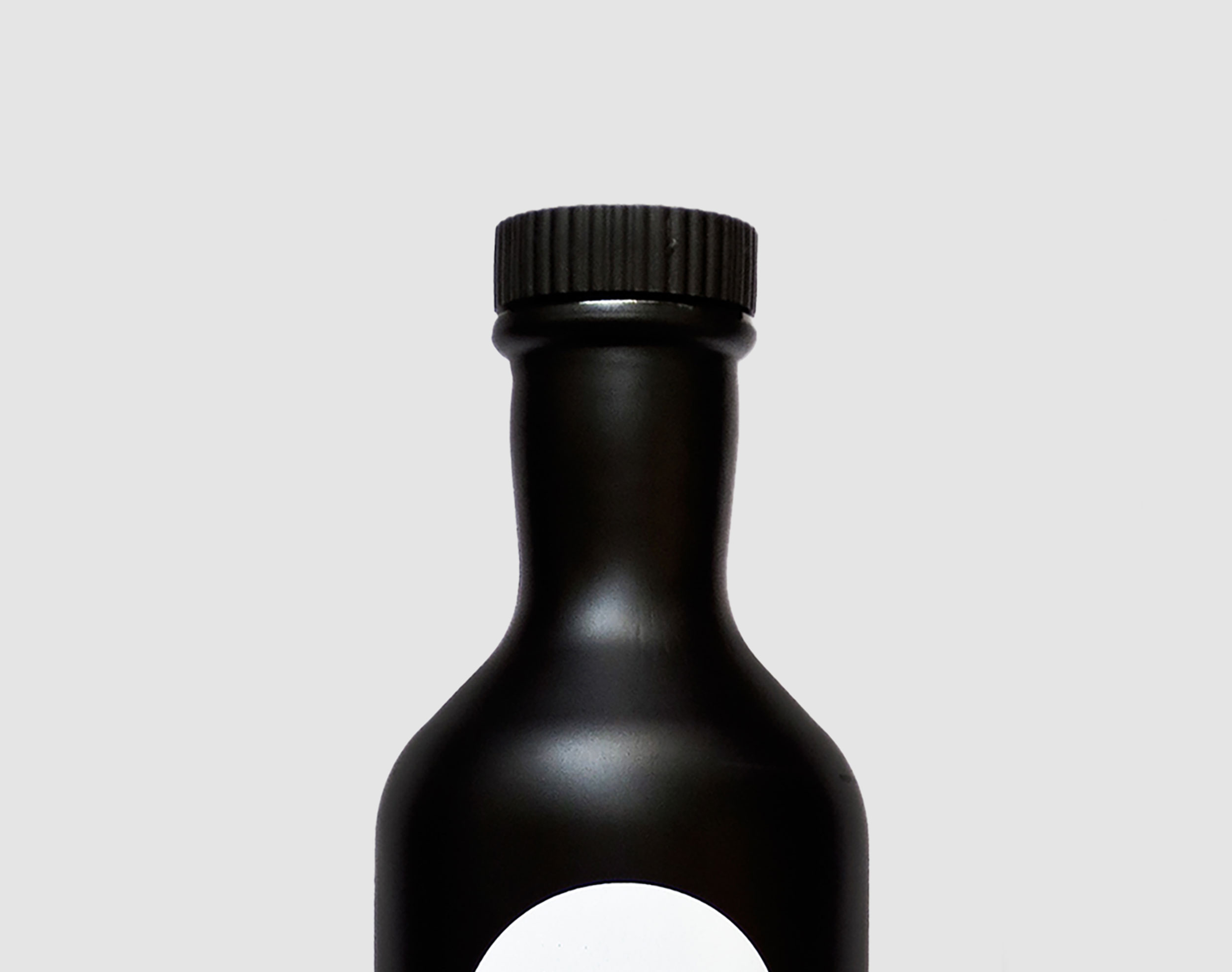
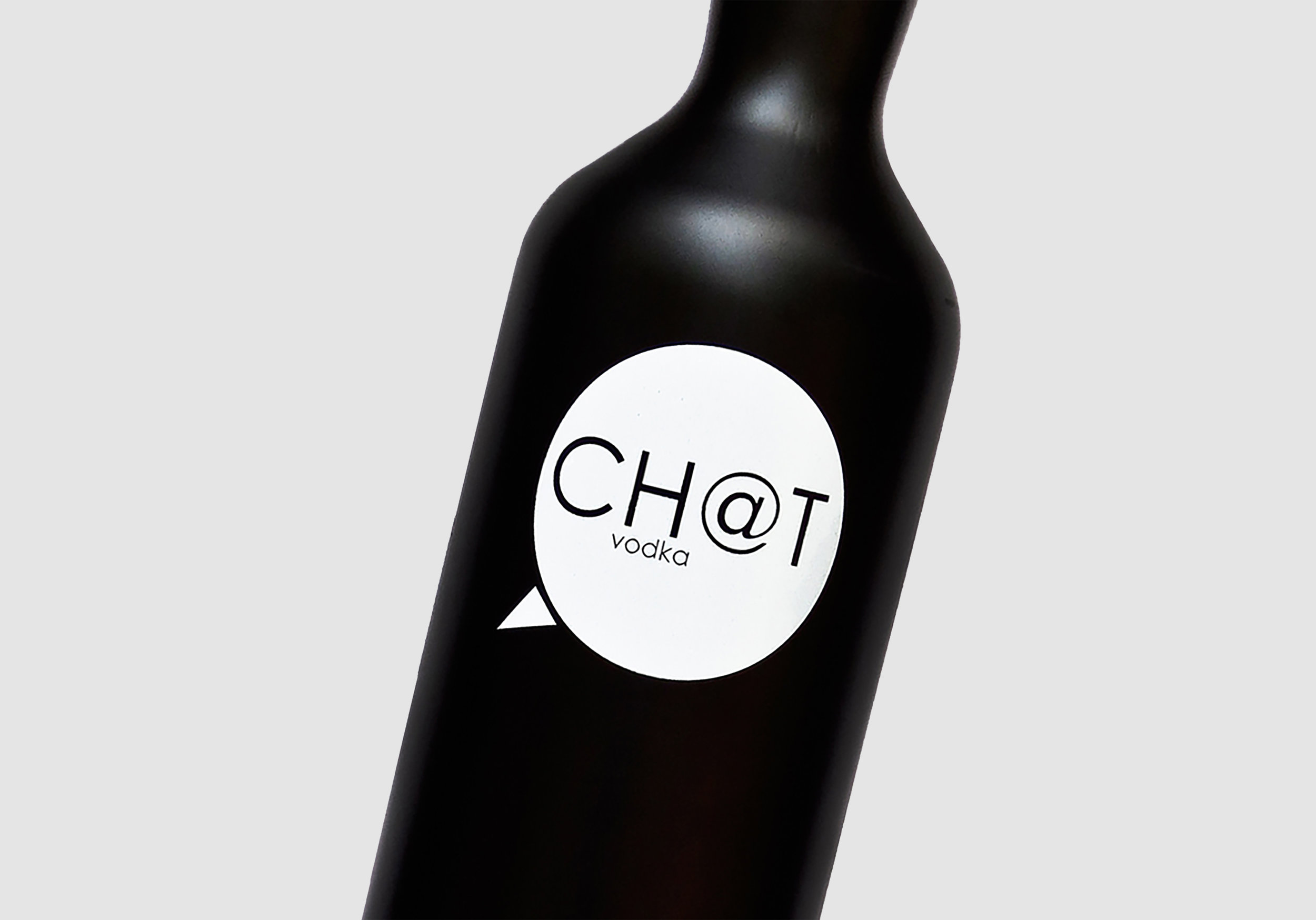
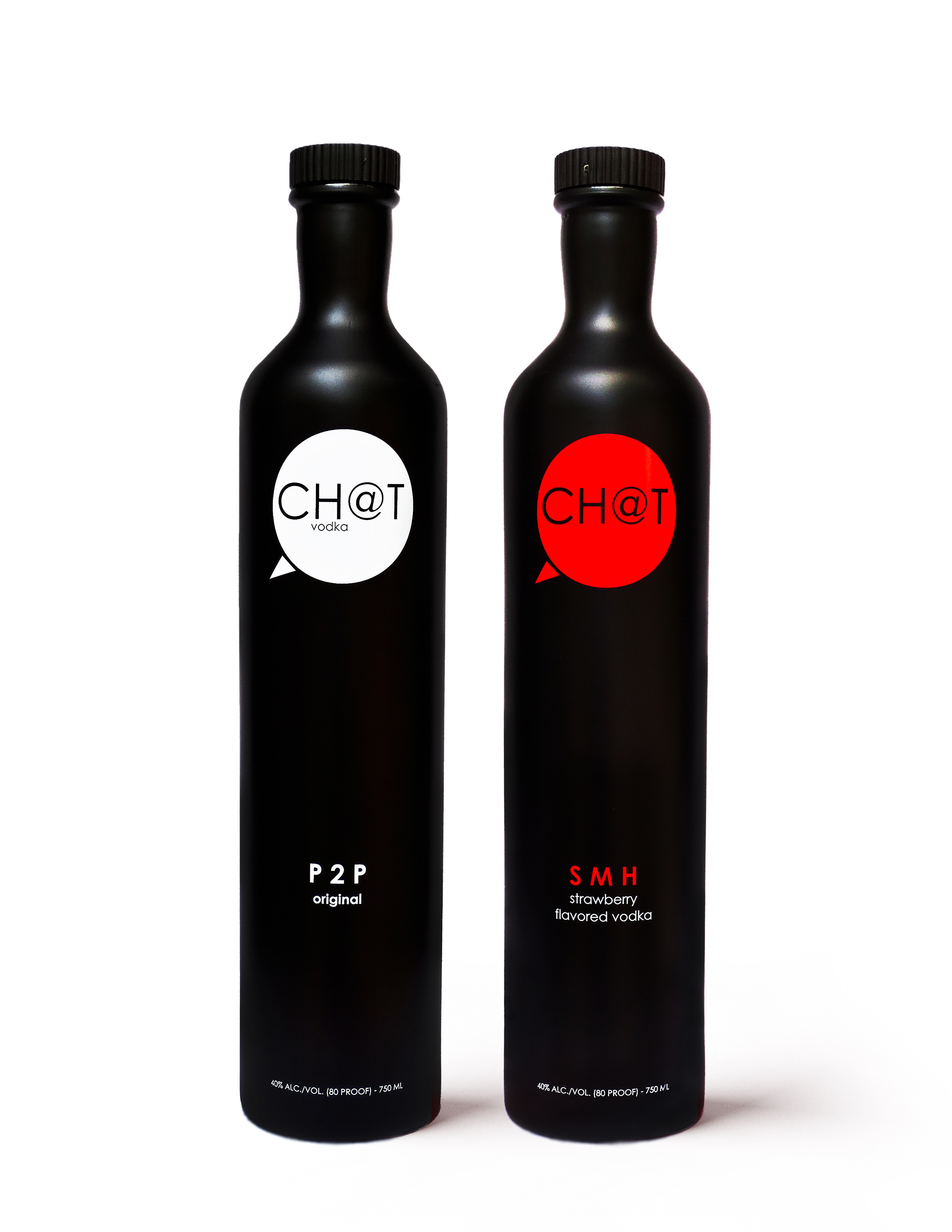
“With its sleek modern design, matte black bottle and custom molded cork, Chat (CH@T) stands out from the many other vodkas on the shelf. Whether Chat is drank straight on the rocks or mixed, the ultra-premium vodka does not disappoint. Chat was recently awarded a gold medal in “The Fifty Best Domestic Vodka” tasting held in New York.”
“The other thing helping it stand out is its youthful appearance. While Vodka is enjoyed by drinkers of various ages, its marketing demographic is rarely someone in their early 20’s. Chat Vodka flips that on its ear by labeling bottles with popular text acronyms, helping younger drinkers relate to its product. ”
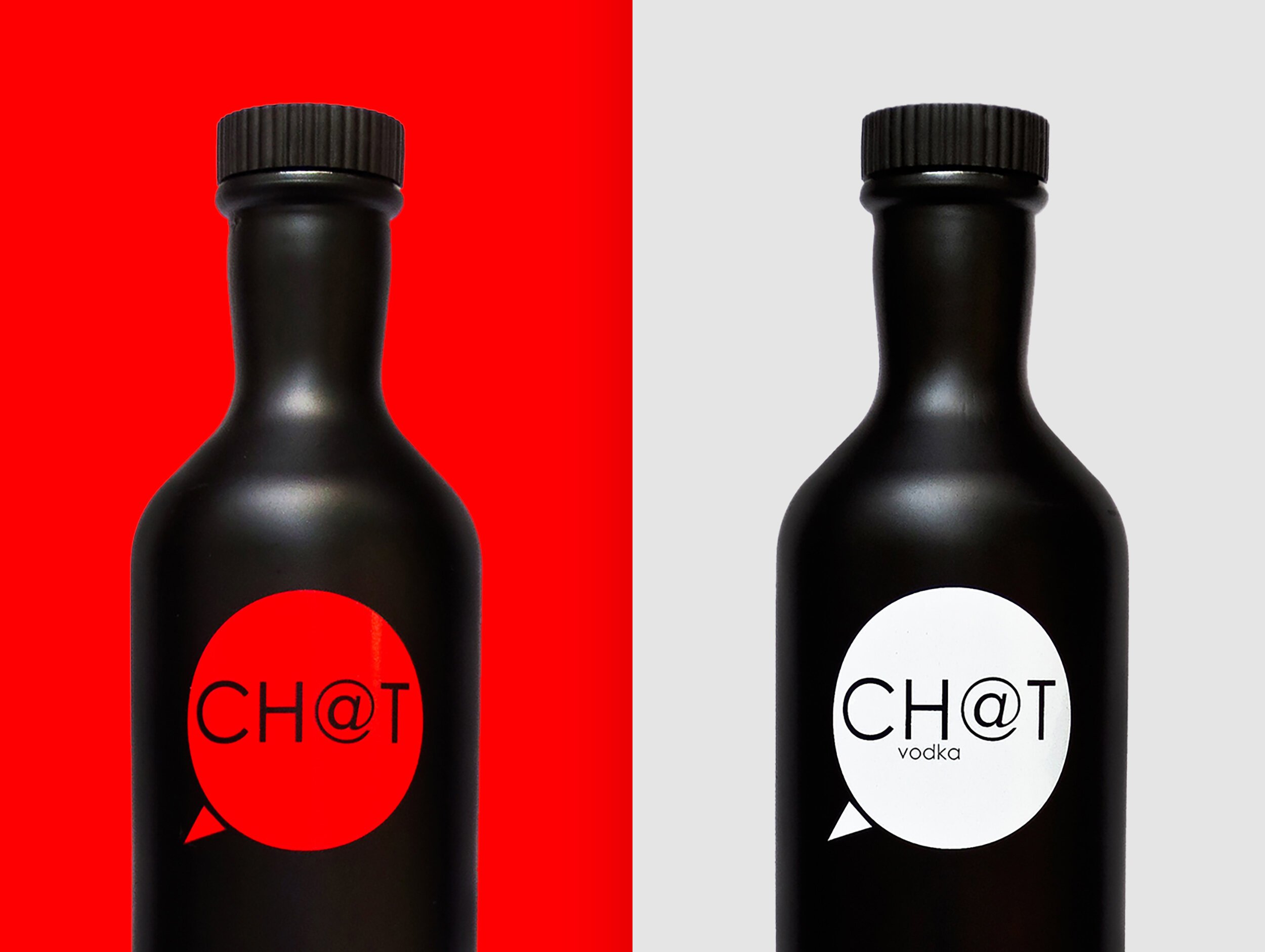
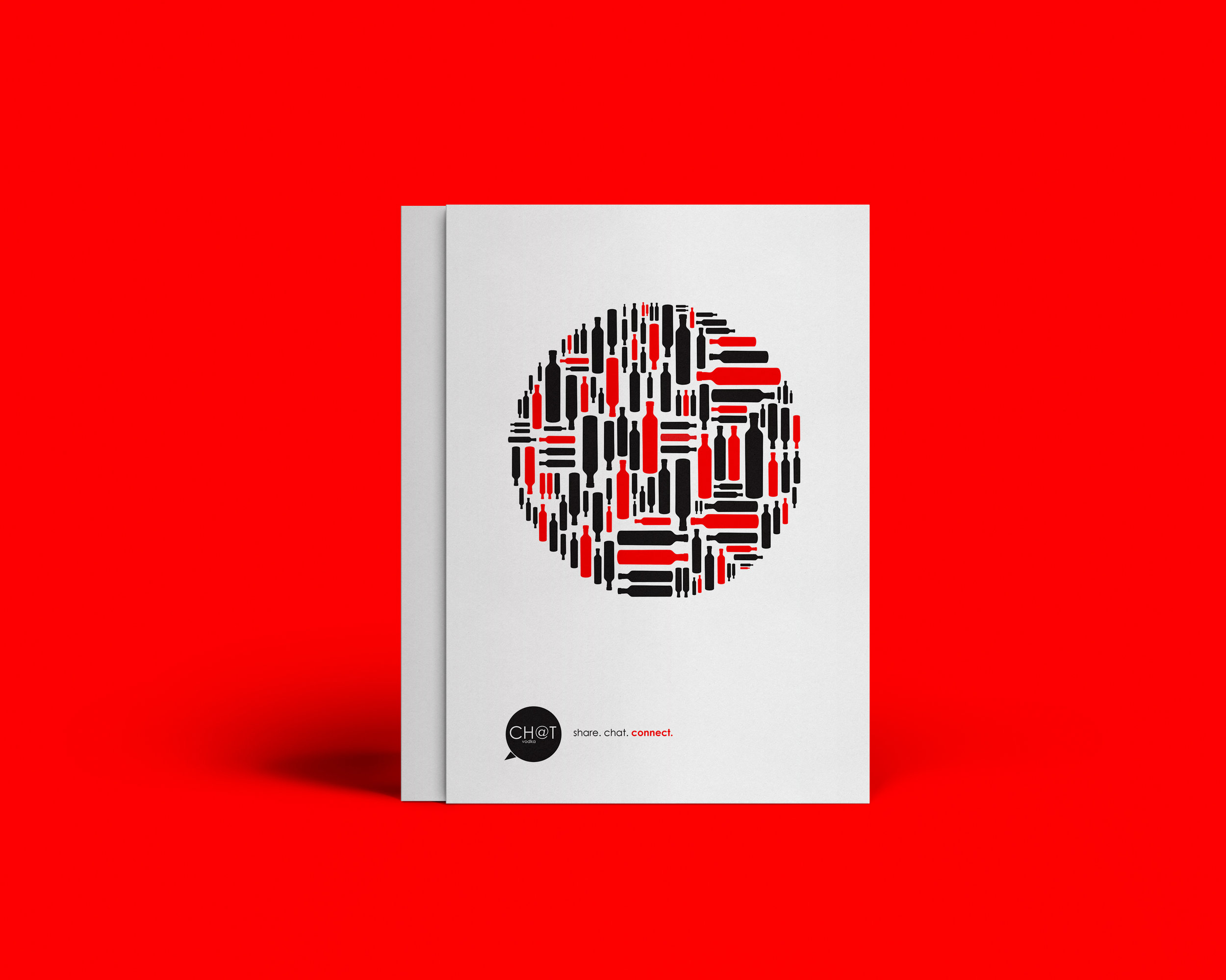
The name Chat was chosen to symbolize three main brand values: conversation, communication and connection. The core demographic of Chat has a life that significantly revolves around talking, texting and dm-ing and Chat was born from the desire to enhance those conversations, relationships and experiences. The brand concept was heavily influenced by acronyms and the way communication has dramatically shifted throughout the years.
Chat Vodka came to life unexpectedly. What began as a college visual identity project quickly turned into something much bigger—I couldn’t shake the idea of bringing it beyond the classroom. After a year immersed (figuratively) in vodka, Chat hit the market, launching first in New Jersey. Since 2011, it has found a home in over 26 locations across four states, proving that sometimes, the unexpected turns into something pretty cool.
My Role:
Founder, Creative Director, Designer
What I worked on:
Visual Identity
Packaging
Brand Messaging
Social Content
Photography